Sunday, 29 May 2016

May Roundup

Sheesh, hasn't this month just flown!

Here is a look at some of the projects that I have created over the last few weeks...

This bright page was up on the Simple Stories blog not that long ago. In the post, I'm talking about using your stash tonally to keep it interesting. Click here to see the full post


This pop up card was heaps of fun to make! You can see the full details here along with the video link of how to put one together yourself. I promise, it's not as complicated as you think!


Simple Stories and Petaloo are having a product swap and there is some amazing inspiration from both teams on both blogs right now. The next two pages combine beautiful blooms and the brand new 'Bloom & Grow' and 'Sunshine & Happiness' collections.

Click here to view the full posts with lots of info on how these pages came together and to enter the competition to win an awesome combination prize from both manufacturers!


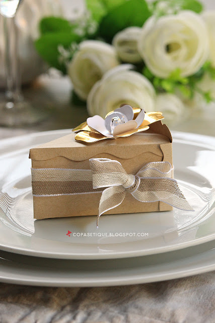
Have a special event coming up? What about giving your guests these light up wedding/party favours for a fun, interactive gift. You will find the step by step instructions are over on the We R Memory Keepers blog


Another page from the tonal post over on the Simple Stories blog. This one uses a favourite stencil along with Life in Color collection.


I'll be back soon with some more projects which will be up in the coming weeks.

Til then!

Monday, 2 May 2016

BeYOUtiful - The Cut Shoppe GDT and giveaway

The lovely Ashley Horton from The Cut Shoppe has asked me to Guest this month, how exciting.

I chose two files to play with, 'I'll Fly Away' and 'Just be You'. They were perfect to document my little one's birthday a couple of years ago. Her wish was to play the day away. Starting with a makeover for me and some face painting for her, we had such fun together! I've also used the gorgeous new We R Memory Keepers Flower Girl collection, pulling lots of butterflies and floral elements to compliment the sweet butterfly cut file.


I knew I wanted to use each file a slightly different way. The butterflies would be drawn as a base to give lots of lovely interest without the bulk of an additional layer. I placed both files in a 12x12 file in Silhouette Studio and tweaked the size/positioning until I was happy.


I then created the cut lines for each. I split the complex path of the butterflies and duplicated a couple, rotating them slightly...


By rotating them a bit, it's given them a bit more of an edgier feel which I really like. After they were drawn on my patterned paper, I then coloured a few lightly with some watercolour paint and a water brush pen.


For my title, I've used a sheet of 'Garden Path'. 
The little white dots were just a touch too distracting so I've misted it with Navy Color Shine. This has toned it down nicely, making it much easier to read.


Lots of lovely layers!


It just so happens that today is my birthday and to help celebrate, I'm giving away one of my favourite files from the Cut Shoppe! If you're on Instagram, head over to my feed to leave a comment to enter. The winner will be drawn this Friday 6th at 6pm EST.

Good luck and thank you for stopping by!